Typeface Poster and Website
- Web Design
- Print Design
- Coding
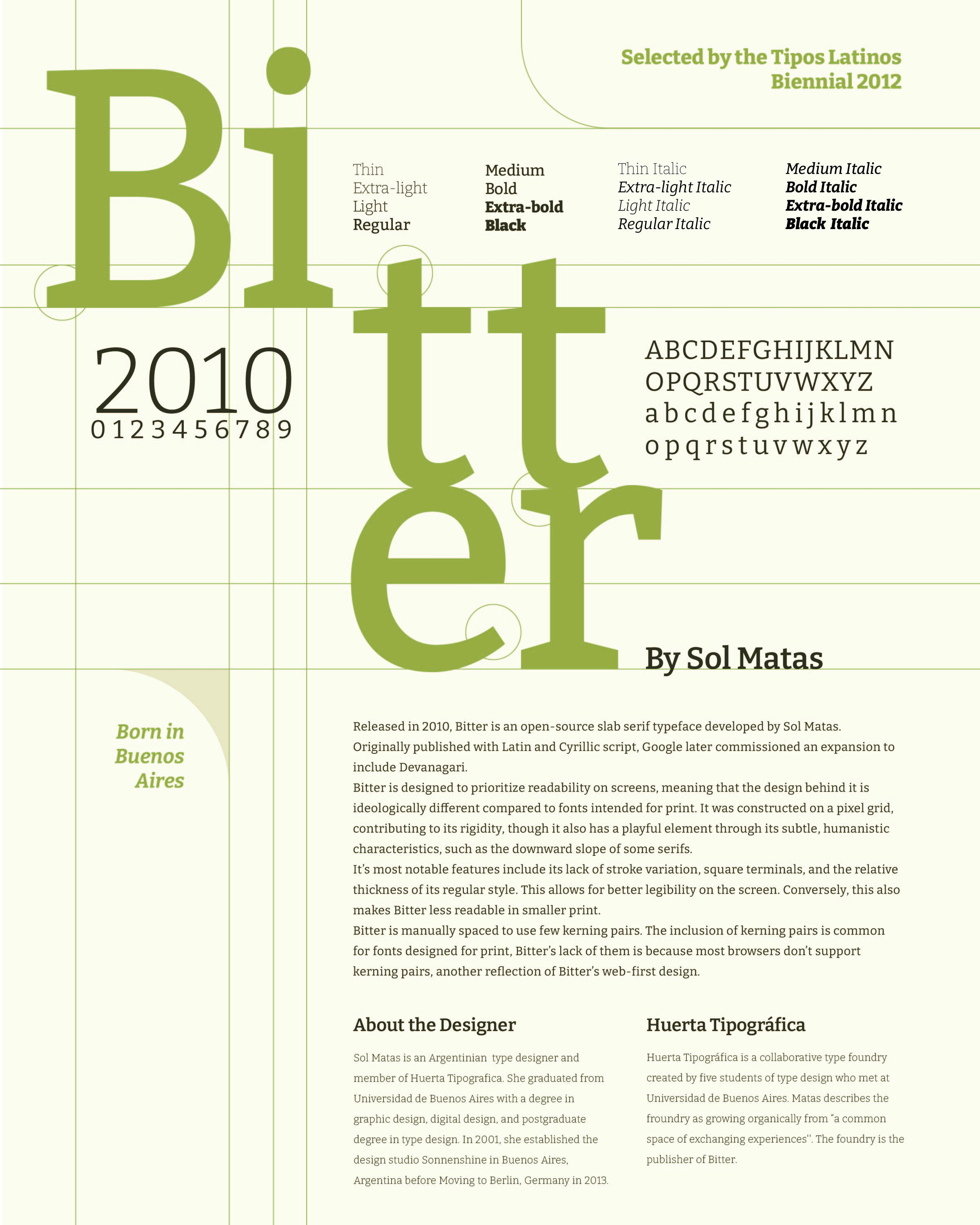
A two-part project which focuses on the typeface family Bitter, an open-source typeface designed for the screen.
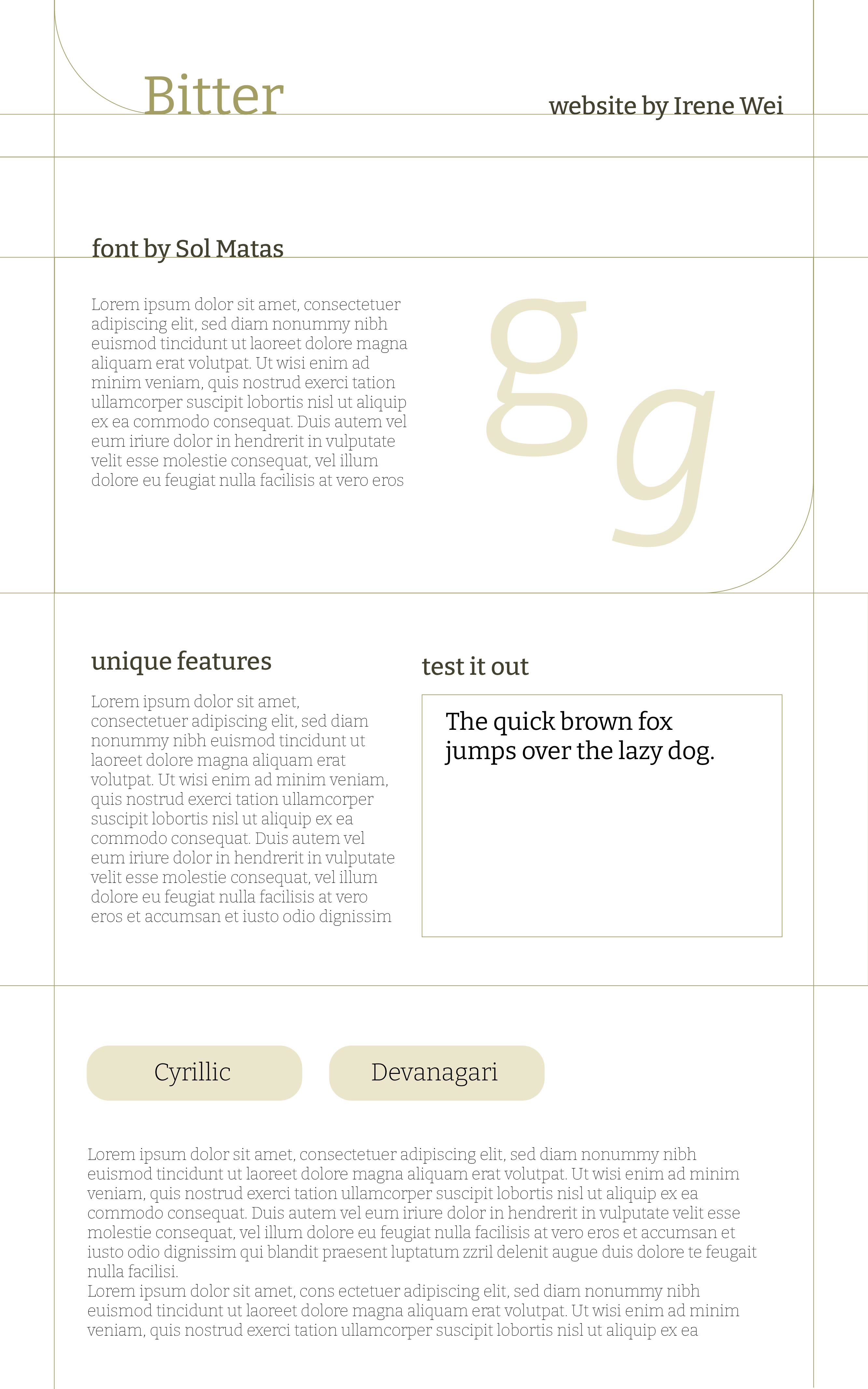
Part 1: Poster
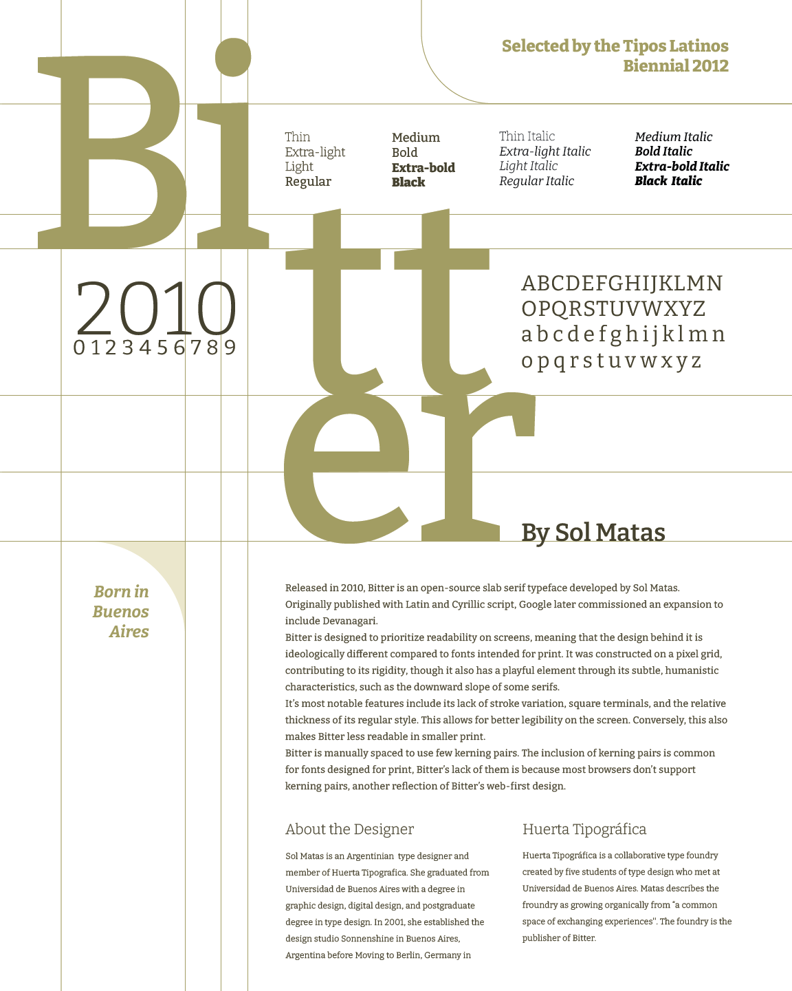
We were tasked with creating a poster to promote and explore the history of a font of our choosing. Special attention was made so that the design reflected all facets of the typeface. The lines is inspired by the font's creation process of starting from a pixel grid.
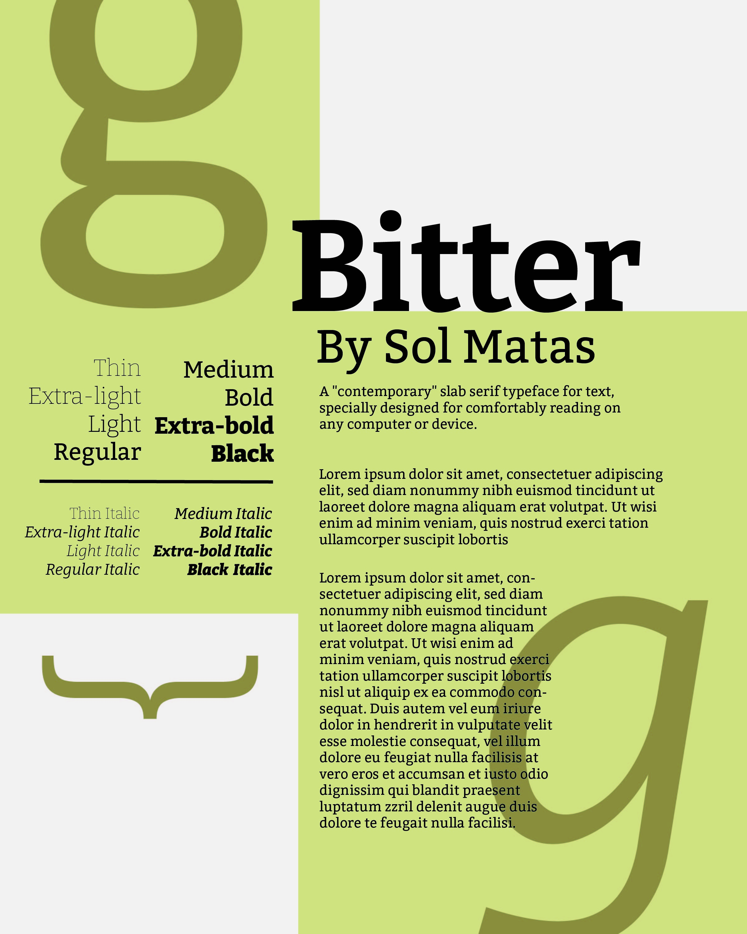
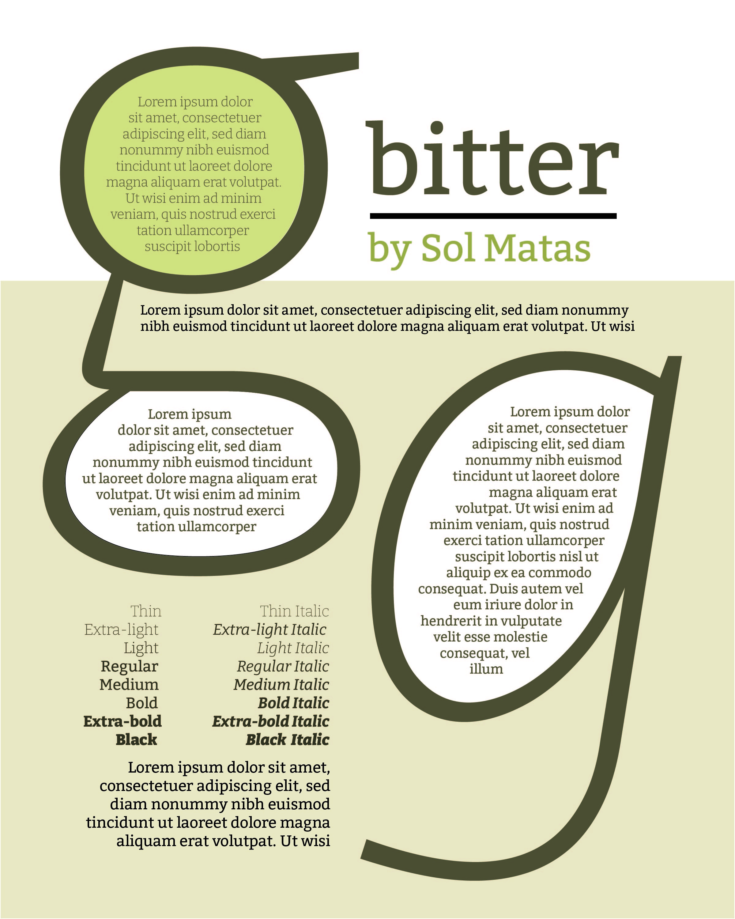
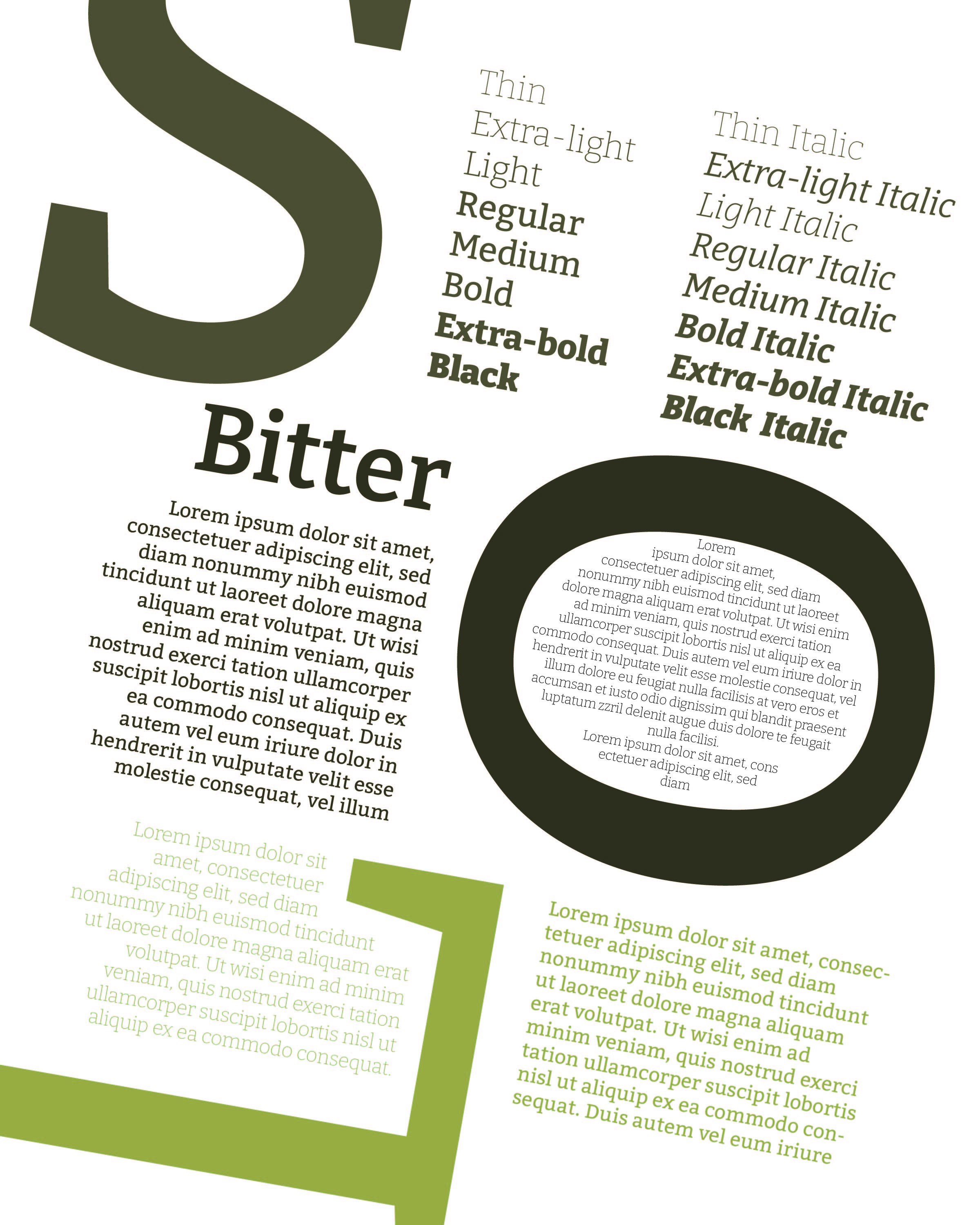
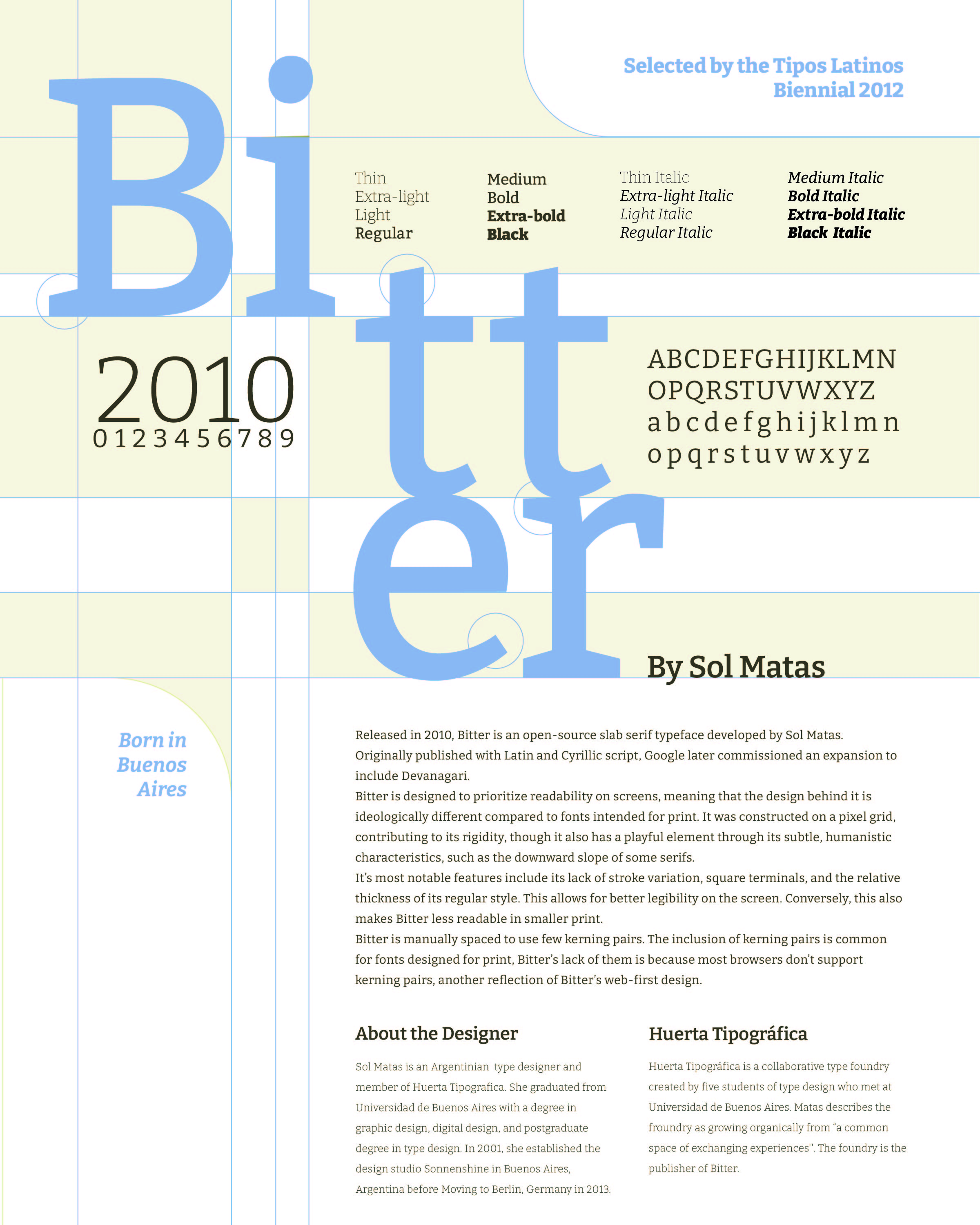
Process
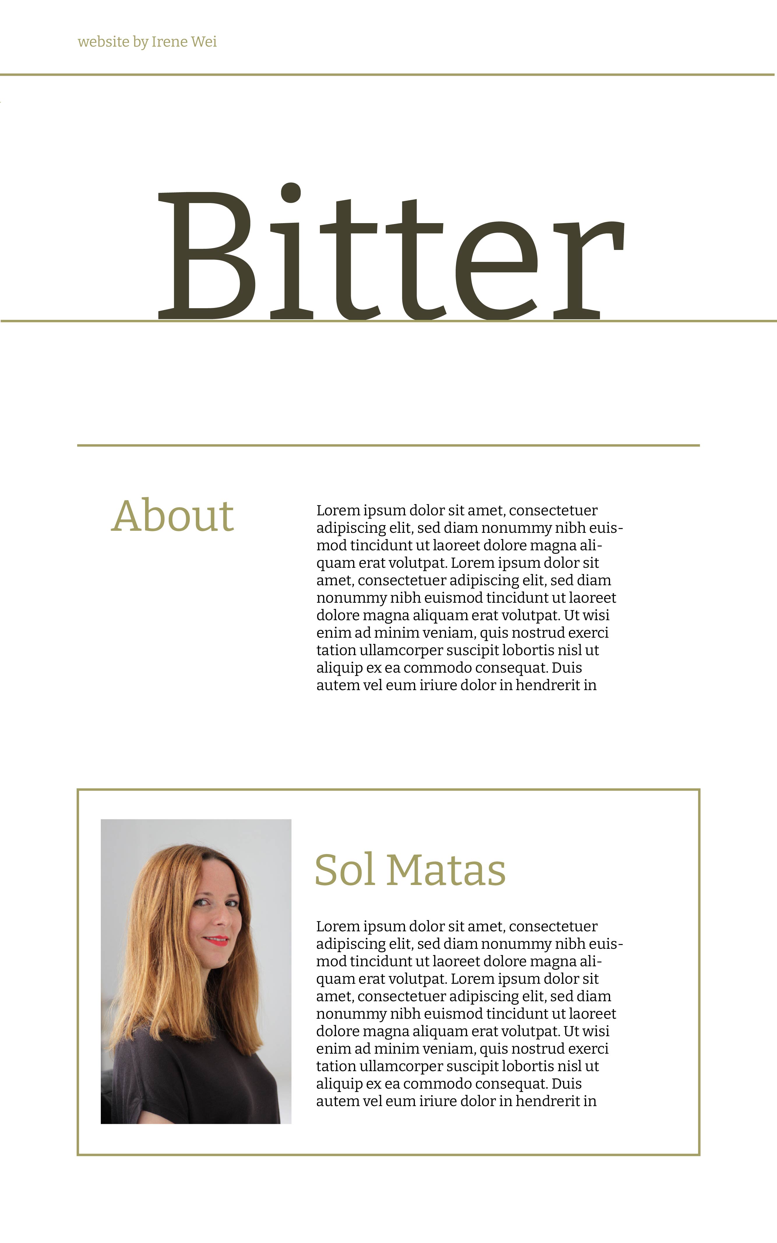
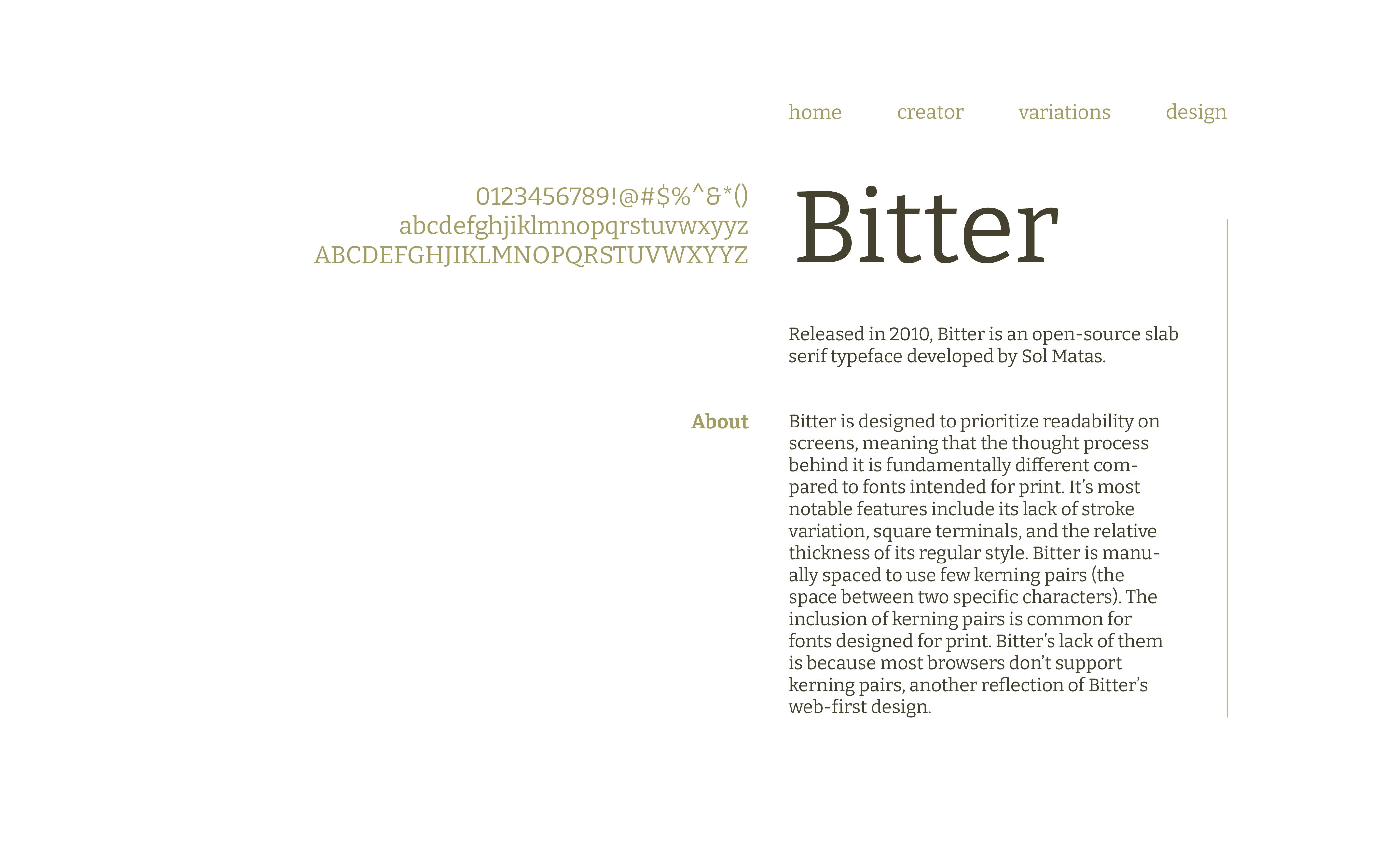
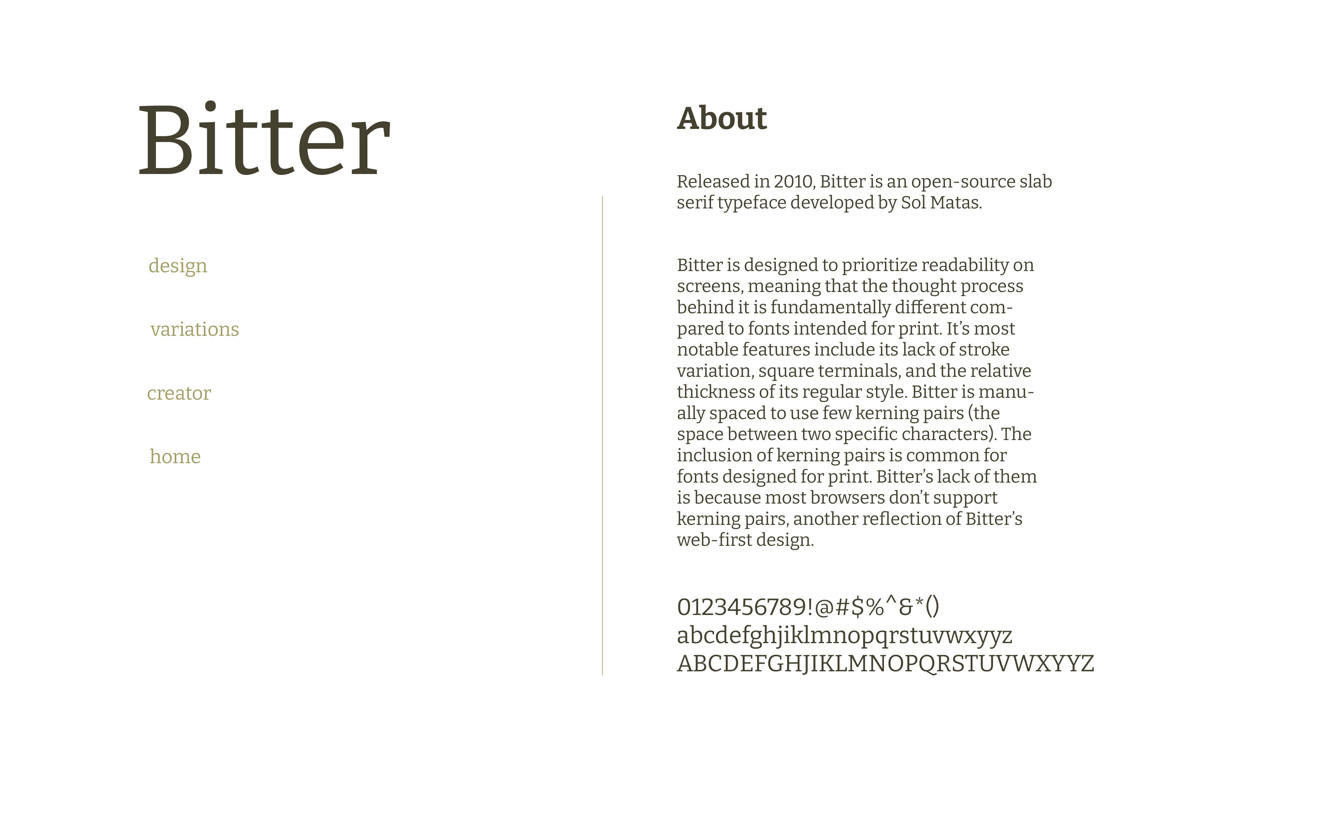
Part 2: Website
best viewed live at typography1.neocities.org/
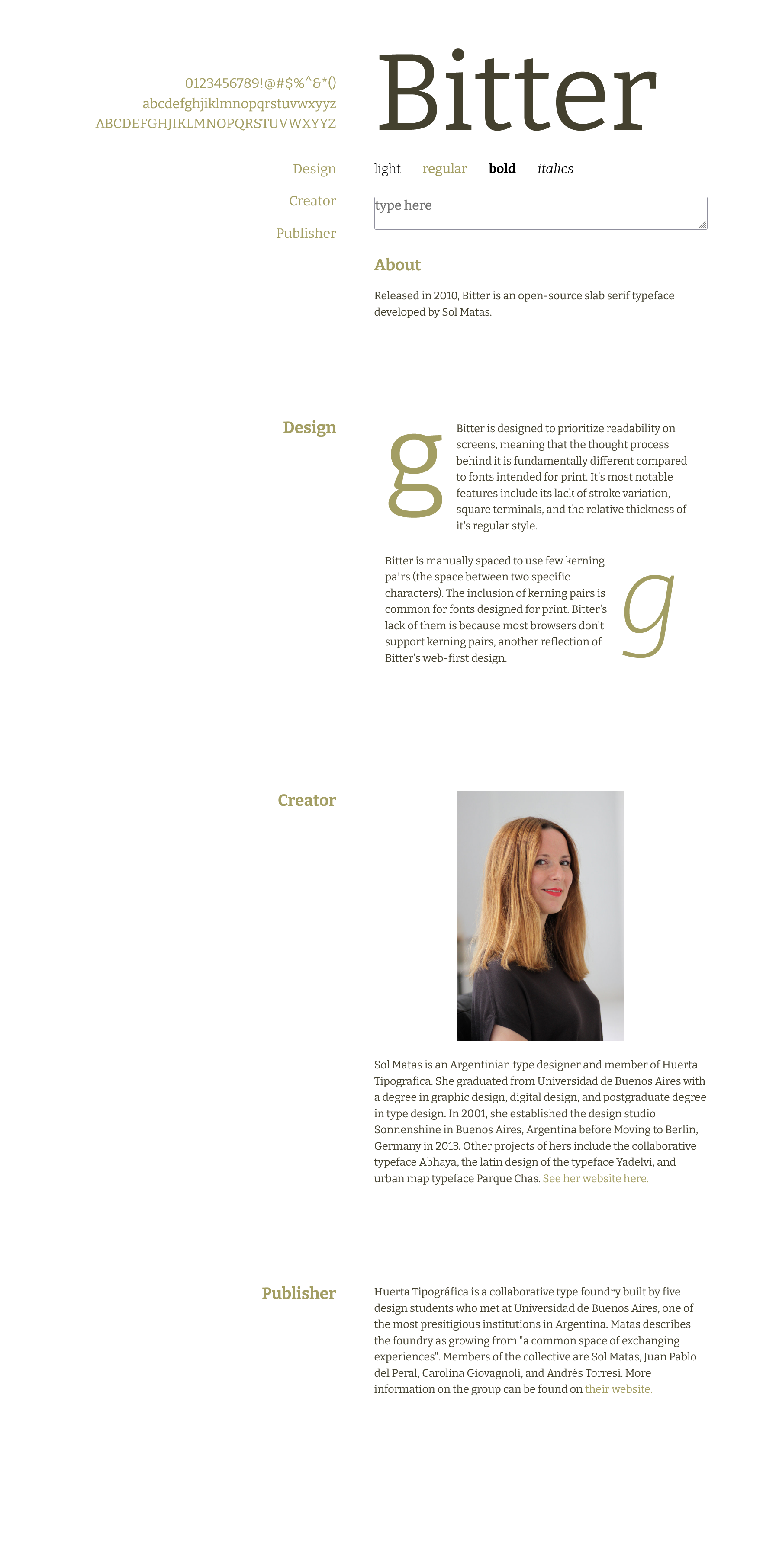
The website explores web readability/usability for fonts using the design language I established in my poster.
Process